ODL 40th Anniversary Branding
Client: ODL Orthodontic Lab
Agency: Hueston
The Challenge
ODL Orthodontic Lab was approaching a significant milestone: 40 years!
As their marketing partner for over three years, we (Hueston) had built a strong relationship and deep understanding of their brand. We were honored to create their anniversary branding that would communicate their legacy while celebrating the era that shaped their beginnings.
But this wasn't just about making things look "retro." ODL's story is deeply personal: a family legacy spanning generations, from Frank M. Casto graduating from Edward Angle's Orthodontic School in 1902, to Jim Wright (an auto mechanic turned orthodontic craftsman) building a lab in his father's basement in 1984, to his sons and son-in-law expanding the business tenfold today.
The challenge was to create a visual identity that would authentically tell that story in a creative and innovative way - true to ODL.
The Insight
Every brand has a story, but not every brand tells theirs. I started this project the way I start every project… by listening. Digging through ODL's archives of images and keeping who I know ODL to be in the forefront of my mind.
I kept seeing vintage photographs from the 1980s lab showing colorful stacked case bins. Our client also pointed out that those exact bins are still used in their facility today, just with updated colors. It was such a simple detail, but it told the whole story: ODL has been doing the same meticulous, world-class, hands-on work for 40 years. The tools changed, but the commitment never did.
This became my creative anchor. The branding couldn't just look like the 1980s—it had to embody the continuity between then and now. ODL's story isn't about nostalgia; it's about consistency, craftsmanship, and a family that's been perfecting their process for four decades.
It just so happens that their colorful stacked case bins look pretty reminiscent of the retro stripes from the 80’s. They layup was undeniable! :-)
The Creative Solution
Anniversary Logo & Identity System
Great branding should feel inevitable—like it was always meant to be that way. The striped logo system does exactly that because it's rooted in ODL's real story:
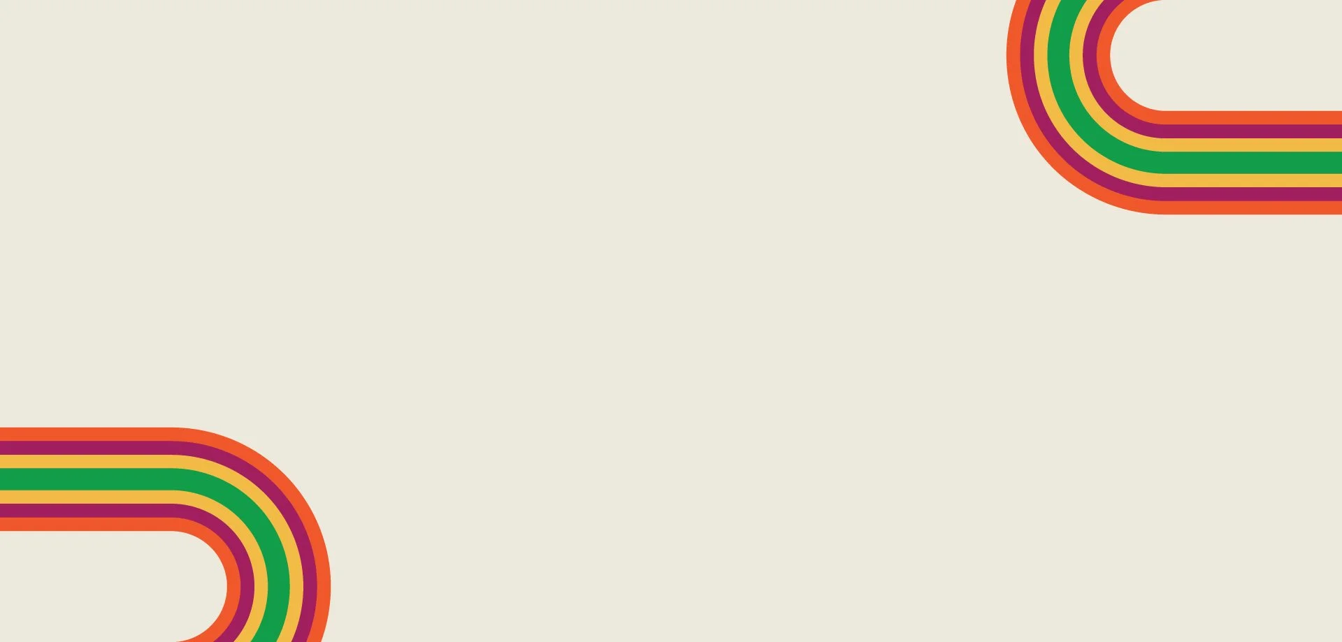
The Era: The 1980s weren't just "retro cool"—they represented optimism and innovation. Brands like Apple and Polaroid used rainbow stripes to say "we're building the future." ODL was doing the same thing in orthodontics.
The Case Bins: Those colorful stacked bins from 1984? They became stripes. A visual representation of ODL's layered legacy—each stripe representing another year of craftsmanship, another generation stepping up, another smile perfected.
The Family Story: Jim Wright didn't follow the expected path. He was an auto mechanic who became an orthodontic craftsman. His hands-on, detail-oriented approach built ODL from a basement operation into an industry leader. The stripes are personal, colorful, human. Just like the Wright family's approach to business.
40th Anniversary Landing Page
I created all visual assets and branding elements for the anniversary landing page (developed by our web team):
Custom graphics and branded elements for the scrolling narrative
Polaroid-style testimonial frames reinforcing the nostalgic aesthetic
Archival photo treatments integrating with modern brand elements
Anniversary striped logo applications throughout the experience
Promotional graphics and CTAs for anniversary offers (40% off, free shipping)
Social Media Content
For ODL's 40th anniversary, I created content that didn't just announce a milestone—it invited people into the story:
Nostalgic throwback posts featuring real archival lab photos, showing the Wright brothers as young men building something from nothing
Customer testimonial graphics in Polaroid frames—because testimonials aren't just quotes, they're proof that ODL's work has been creating confident smiles for 40 years
Behind-the-scenes content connecting the 1984 case bins to today's lab, showing the thread of consistency
Promotional content that didn't feel like ads because they were framed as celebration—"we're 40, let's celebrate together"
Email Marketing Campaigns
Visual storytelling that honored four decades of relationships
Anniversary branding that made recipients feel like part of the celebration
Promotional architecture that said "thank you for 40 years" more than "buy now"
Design Details
Typography: Balanced nostalgic personality with professional credibility appropriate for a B2B healthcare context
Photography Treatment: Mixed archival imagery with contemporary photography to create visual harmony between heritage and innovation
The Results
The anniversary campaign successfully launched across all touchpoints, providing ODL with a cohesive brand moment that honored their past while positioning them for future growth. The visual identity resonated with both long-time partners and new prospects, demonstrating how thoughtful design can bridge generations of service.
Most importantly, the work authentically told ODL's story—from basement startup to industry leader—in a way that was both celebratory and true.
